MAmA Anne
UX design for a global clinical training simulator

My role: UX Designer & Researcher
Design team: Franziszka Heuck (Service Designer), Nitin Gurram (Industrial Designer), Hector Rodriguez (Industrial Designer)
The CHALLENGE
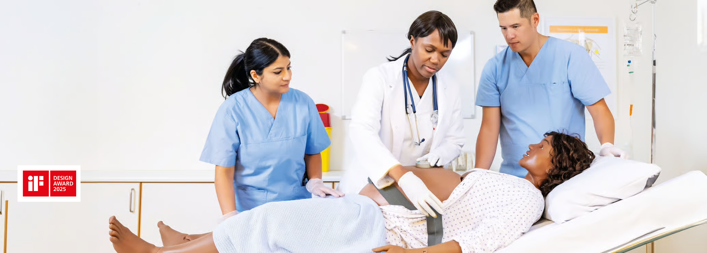
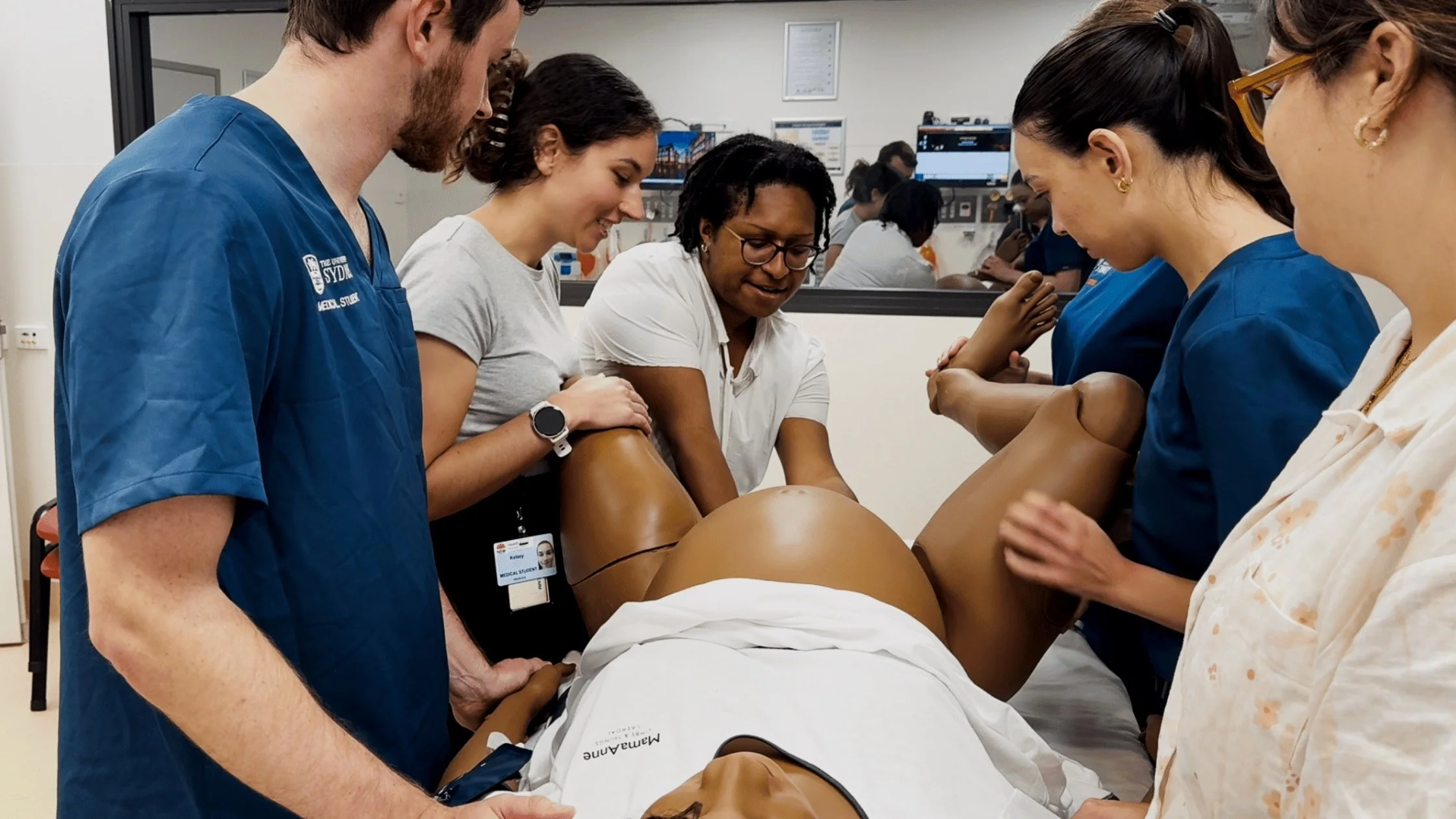
MamaAnne is Laerdal's next-generation maternal simulator, used globally to train healthcare teams in managing childbirth emergencies. While the physical manikin had been redesigned for easier setup, the digital interface controlling it was still outdated and non-intuitive, with a steep learning curve.
What I did
I led the UX design, challenging who we were designing for, aligning disconnected design teams across multiple touchpoints including mixed reality and conversational AI, and making a strategic case for a more inclusive design, that has since been adopted across the whole product. The work contributed to MamaAnne winning the 2025 iF Design Award.
Who is MamaAnne?
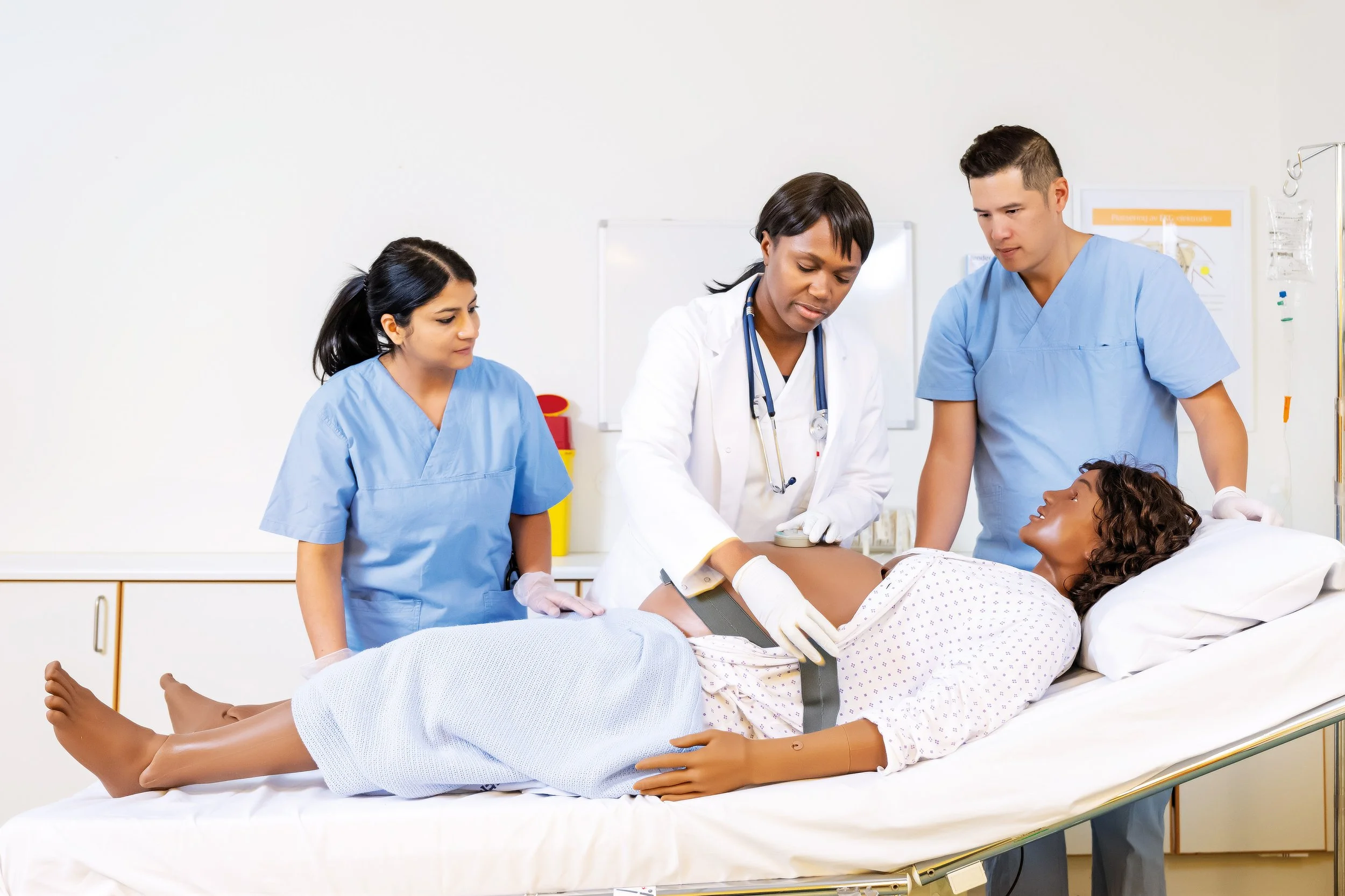
“Maternal fatalities occur nearly every two minutes, and many of them are preventable.
MamaAnne is a high fidelity robotic simulator that creates immersive training to prepare and prevent these deaths.”
Who Are The Users?
MamaAnne's primary users are simulation technicians and clinical facilitators, who run simulations for teaching and training in different contexts. They come with different specialist backgrounds and levels of tech literacy, are highly skilled multitaskers, often having to manage multiple software systems, voicing patient responses, and controlling the pace of a birth simultaneously.
The secondary users are the participants whose experience depends entirely on how well the technician can control it.
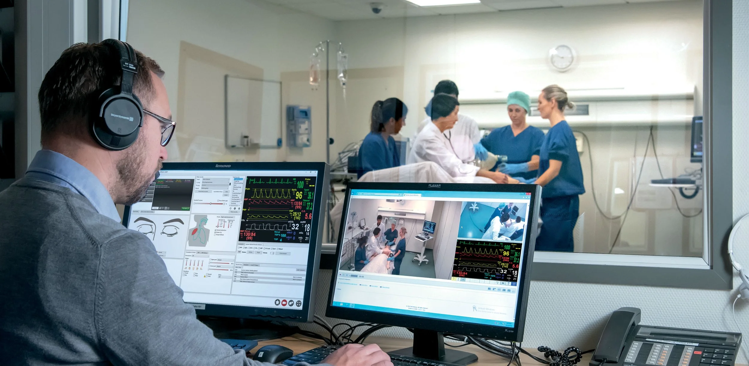
Designing In A complex ecosystem
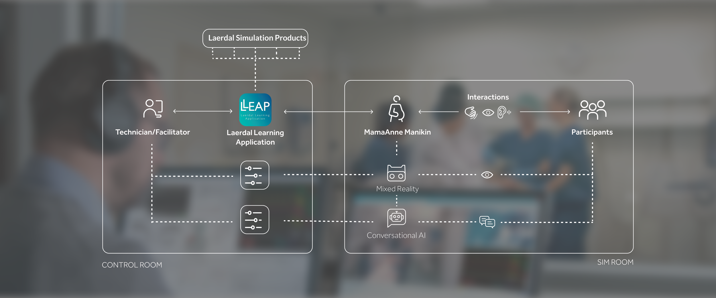
MamaAnne sits at the centre of a complex ecosystem connecting the digital and the physical, across spaces and time. One of my first observations was that the design and engineering teams working on each touchpoint were designing independently, without considering the cumulative cognitive load on the user or how the physical separation of spaces would affect their experience. I brought these teams together in workshops to map the full experience and identify where touchpoints were conflicting rather than complementing each other.
The Result
A customisable dashboard with all controls and feedback in one overview
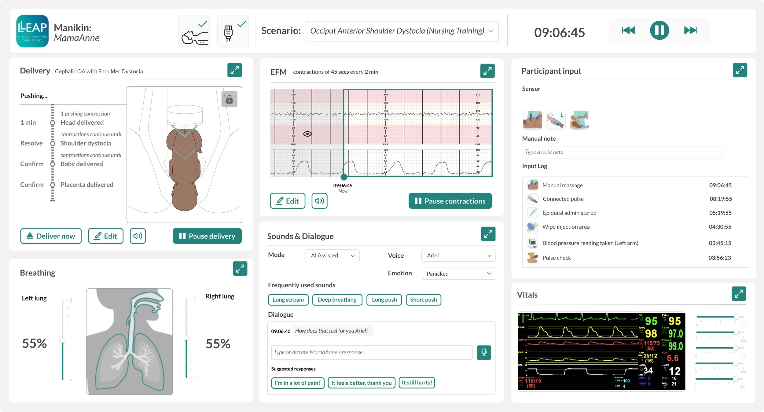
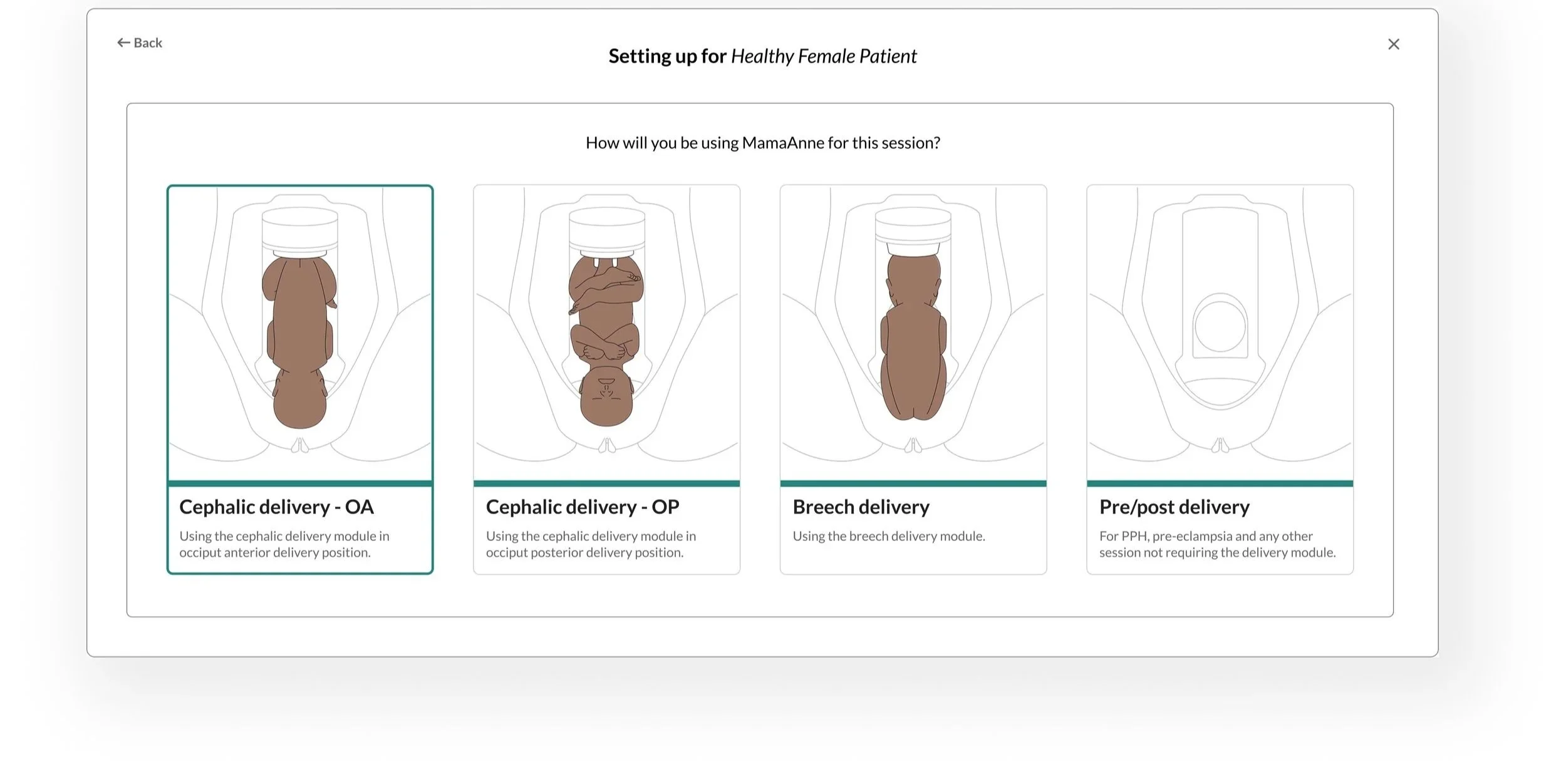
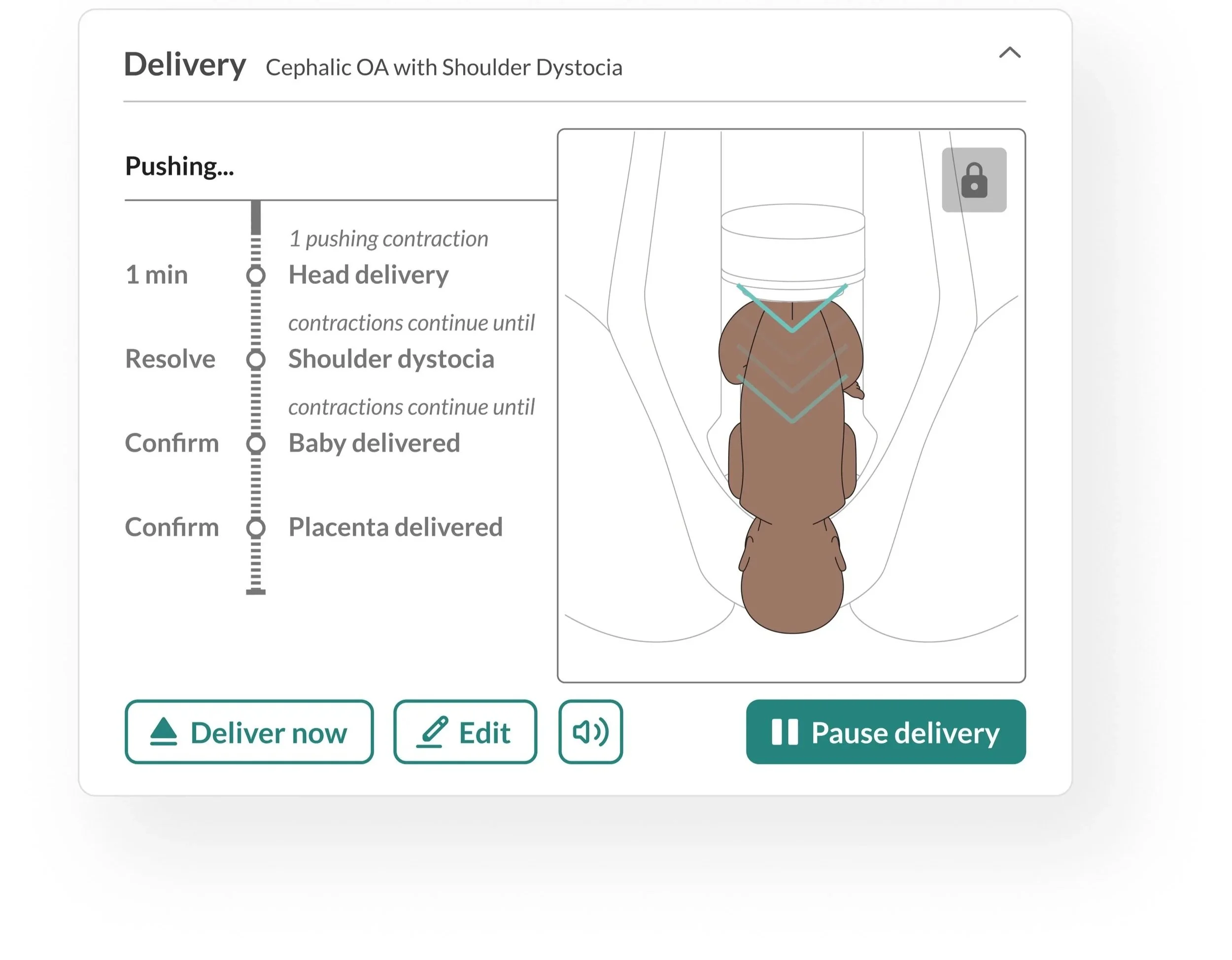
Clear visuals for an easy set up
This screen uses clear illustrations of delivery positions that match the physical setup of the manikin. By combining visuals with concise descriptions, the interface supports faster decision-making and helps users, regardless of clinical experience, set up scenarios accurately and with greater confidence.
““ Having the visuals really helps me to understand how the set up should look and what each medical position means.””
AutomatED BUT ABLE TO CHANGE THINGS ON THE FLY
Users needed to know what was coming and when, but maintaining control of the pace was equally important. They needed to respond to what participants were doing in real time. The solution was a hybrid of automation and manual control, where the system guides the sequence but the user stays in charge.
“‘ I need to know what is happening now, what is coming next and when the head will be delivered so I can ensure the students are doing the right things at the right time.’”