FAP
Reimagining Flight Attendant communications
Individual GUI design project at the Umeå Institute of Design
Duration: 1 week, winter 2019
Brand: Norwegian
Skills: desktop user research, UI prototyping (Sketch and Principle) mockup testing,
Opportunity
This project focused on redesigning the Graphical User Interface (GUI) of a Flight Attendant Panel (FAP), from which various functions related to environment, lighting and emergency alerts are controlled by the crew in an aircraft. The current designs are outdated and we were asked to consider its relation to Solid User Interfaces (SUIs) while integrating these with the values and identity of Norwegian Airlines.
Was it possible to create a new interface for the flight attendants while including the values of the Norwegian Airline brand?
Solution
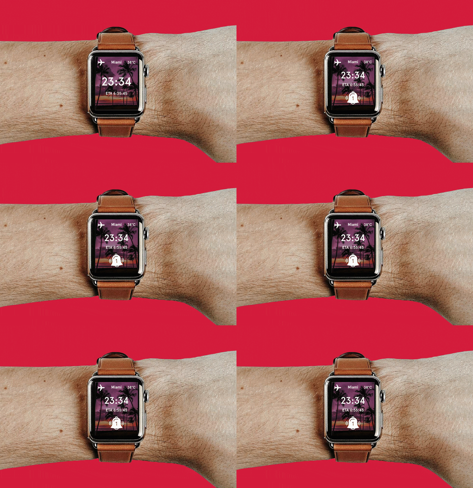
A system which moves the interface of the flight attendant controls from a single screen in a fixed location to a wearable device. Using the wearable FAP, flight attendants are able to make changes to environment, attend passenger queries and communicate without have to walk back and forth up the aircrafts narrow corridors. The simple graphics and easy functionality reflect the Norwegian brand values of simplicity, accessibility and teamwork.
Simple navigation menu
Passenger Alerts
Easy light change settings
HOW I GOT THERE…
WHAT IS A FLIGHT ATTENDANT PANEL
Used by air stewards to control the environment, doors and alerts in an aircraft.
Design features are often prescribed by the aircraft maker and are usually very counter intuitive. The hierarchy of functionalities often makes little sense, this often results in only one functionality being utilised.
Flight attendant communication often happens through the aircraft, through visual hand signals up and down the aircraft.
Position of the FAP at the entrance of the aircraft
Current interface is outdated and counter intuitive.
“Was it possible create an interface that could support flight attendants better in their workflow?”
Brand Analysis
In creating a new interface, it was important to reflect the brand values both aesthetically and in terms of functionality. The primary themes in the Norwegian brands identity are simplicity, innovation and accessibility for all - it is important for them to offer a great service at prices that everyone can afford. I wanted to keep this in mind while thinking of how a system used by staff might help the brand achieve this.
BRAND VALUES
SIMPLICITY
INNOVATION
ACCESSIBILITY
SUPPORTING TEAMWORK
MOCKUPS and PROTOTYPING
My process involved making quick rough paper prototypes and testing the usability from this angle before refining the details. From this I learnt a lot about the logic I wanted to achieve and also got a better sense of the scales involved, particularly in the case of the apple watch in which visibility on a screen with limited space was key.


